Who are they?
"Empire Online is the official digital destination of the world’s biggest movie magazine – with the very latest film news, decades of movie reviews, and topical discussions of the biggest talking points in the world of cinema.
From genre-centric lists of the greatest films ever made, to the very latest Marvel and DC updates, to comprehensive guides on the most exciting future movies, Empire Online has everything you need to keep up with the very latest goings-on in Hollywood and beyond.
Not only that, but you’ll find exclusive interviews with directors and movie stars, spoiler-filled breakdowns of the latest blockbusters, every episode of the Empire Podcast, plus video game reviews, and TV reviews from Pilot TV – the cinematic TV magazine from the creators of Empire."
Front Cover Analysis:
 Empire magazine front covers are very diverse and each are very unique. I chose these two to have a closer look at as these are what I believe are achievable as a student. The majority of Empire's magazines front covers depict action movies which take a lot of editing. However, there are not many obvious constants, except from the masthead, date and barcode. The main image is alway positioned so that the features of the copy can be scattered around it. Looking at the front covers, I think it is suggestible that the look and positioning of the copy aren't decide until they have their belief of what their main image will look like.
 Online Presence:
Here is the opening page of empire, these are the subheadings of all the areas that are accessible. The image from their website shows all the different areas. It shows their horizontal and vertical integration and how successful they are as a company. It highlight how they attract their 18-40, primarily male, employed, educated audience. The vast and varied article as well as this additional features epitomises why they are successful as they know how to attract wider audiences and encourage them to spend more and keep coming back.
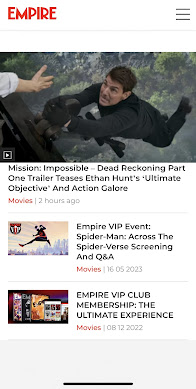
For a mobile, this is the opening home page on empireonline.com. It immediately links to film with an iconic scene from mission impossible. The opening stories include a trailer tease, empire exclusive- screening and Q&A event and also promotion of their VIP experiences.


No comments:
Post a Comment